From Data to Connection
Designing a Human-Centric Booking Flow and streamlining the Lakshayu Web Experience
Healthcare
UX UI
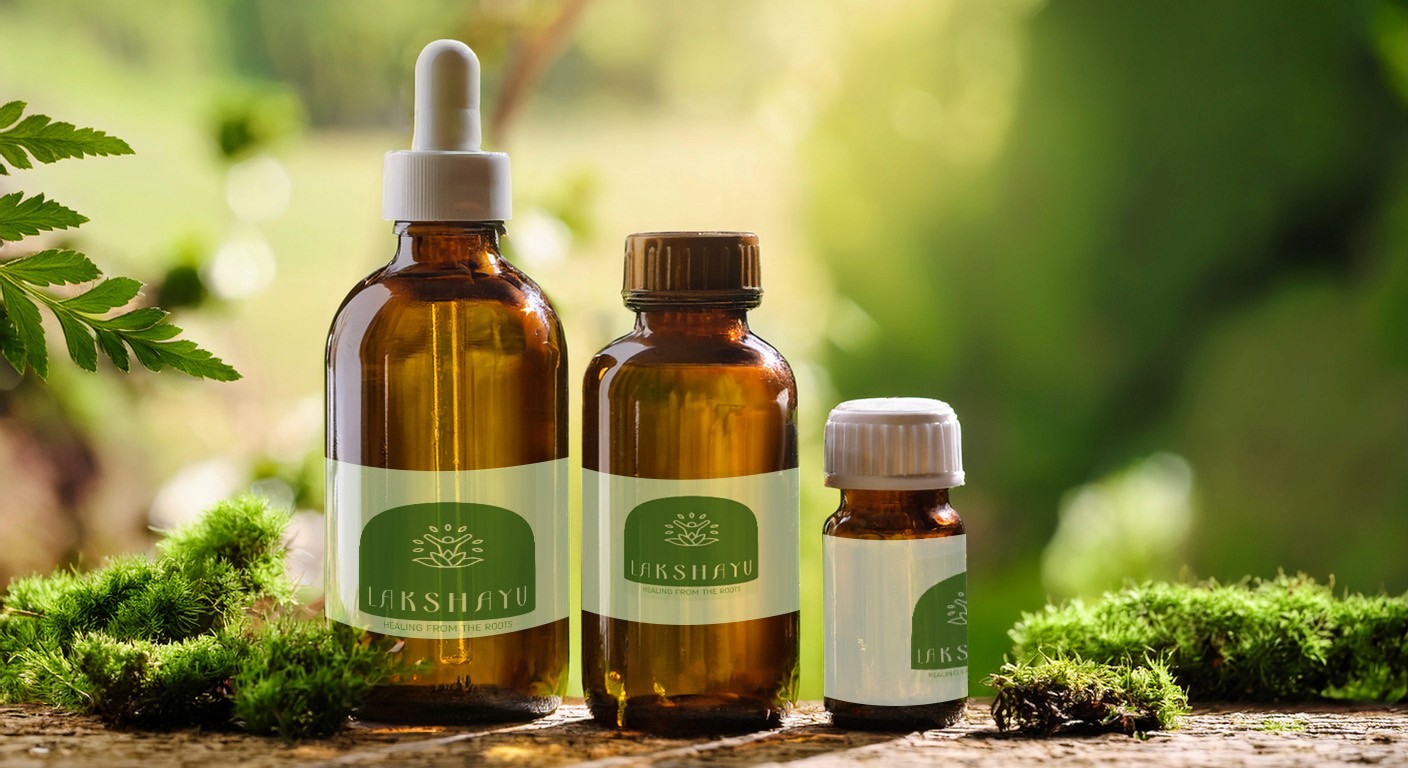
Lakshayu is an Ayurvedic consultation platform dedicated to guiding individuals through personalized wellness plans that promote both preventive care and therapeutic healing. This project involved designing a digital gateway that translates the complex, holistic nature of Ayurveda into a clean, modern, and accessible web experience.
Problem
The primary challenge was a disconnect between the brand's identity and its digital presence. Ayurveda is often perceived as traditional or "old-school," which can sometimes feel intimidating or clinical to modern users.
The User Barrier
Potential clients were hesitant to book sessions due to overwhelming forms and a lack of clarity on how an ancient practice fits into a fast-paced modern lifestyle.
The Transaction Friction
The client preferred a manual, personal transaction process via WhatsApp over a standard automated payment gateway, necessitating a non-traditional "human-in-the-loop" conversion flow.
Research
To bridge the gap between tradition and technology, I conducted research into the "Wellness Seeker" demographic
Competitive Analysis: Evaluated modern health-tech platforms versus traditional local clinics. Most local clinics lacked digital booking, while global health apps felt too "cold" and clinical.
Stakeholder Interviews: Identified that the brand's core value was "human connection." The digital tool needed to facilitate, not replace, the personal relationship between the practitioner and the patient.
Contextual Inquiry: Looked into how users prefer to pay for high-trust services like medical consultations; many preferred direct communication before committing financially.
Insights
Calmness as a Feature
In a stressful healthcare market, a "calm" UI acts as the first step of the therapy itself.
Trust over Automation
For Ayurvedic consultations, users value a personal check-in. The WhatsApp integration wasn't just a technical choice; it was a trust-building feature.
Hierarchy of Wellness
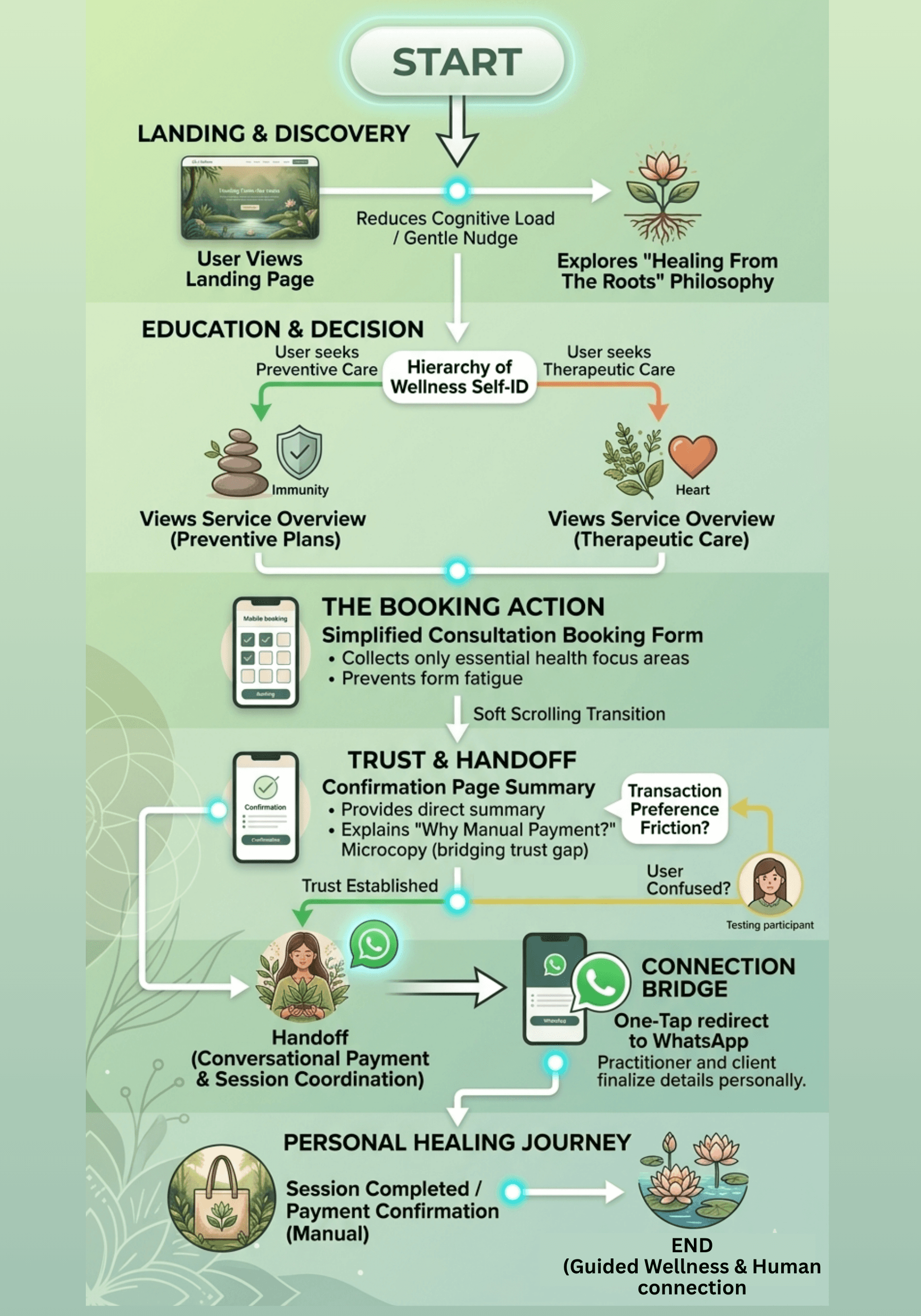
Users need to understand the "Preventive" vs. "Therapeutic" split immediately to self-identify their needs.
Prototype
Interactive prototypes were developed in Figma to test responsive behaviors, complex state changes, and high-density layouts across devices.
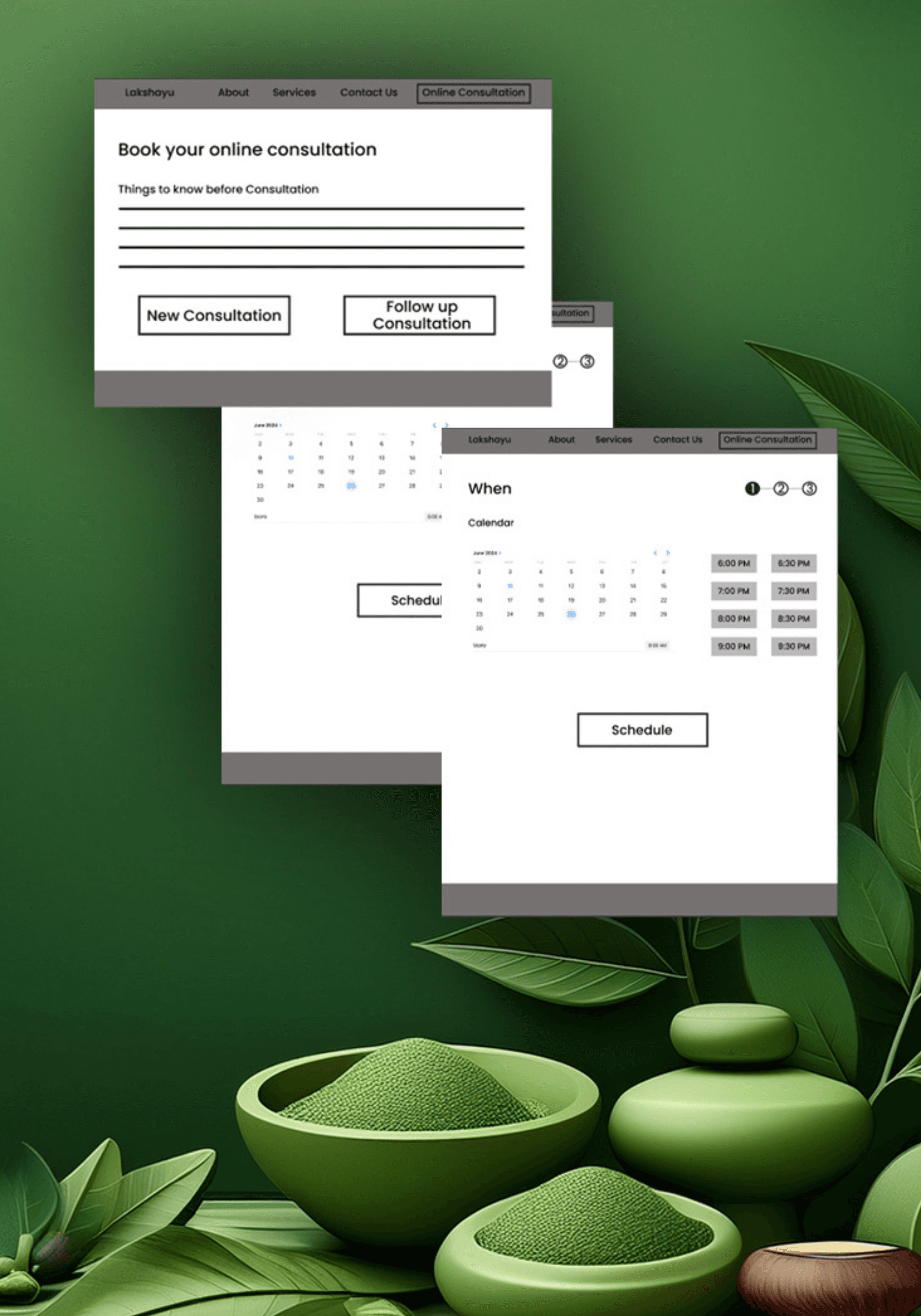
Low-fidelity sketches focused on maximizing "breathability" (whitespace):
The Hero Section: Focused on imagery of nature and balance rather than medical equipment.
The Booking Grid: Designed as a step-by-step progress bar to prevent form fatigue.
Mobile-First approach: Ensuring the WhatsApp handoff felt native to mobile users who already use the app for daily communication.
The visual language was built around "Healing from the Roots"
Color Palette: An earthy, organic palette featuring soft greens and warm neutrals to align with the brand’s wellness ethos.
Typography: A mix of a sophisticated serif for headers (heritage) and a clean sans-serif for body text (modernity).
Imagery: Utilizing soft-focus photography of botanicals and peaceful human interactions to create a welcoming atmosphere.
Prototype
Testing
Conducted moderated usability testing with five participants
Feedback: Users initially found the lack of a payment gateway confusing.
Iteration: I added microcopy on the confirmation page explaining why they were being redirected ("To ensure your plan is fully personalized, our lead consultant will finalize details with you on WhatsApp"). This turned a potential friction point into a premium service highlight.
Solution
The final website is a streamlined, three-tiered experience
0 seconds
0 seconds
Consultation Initiation
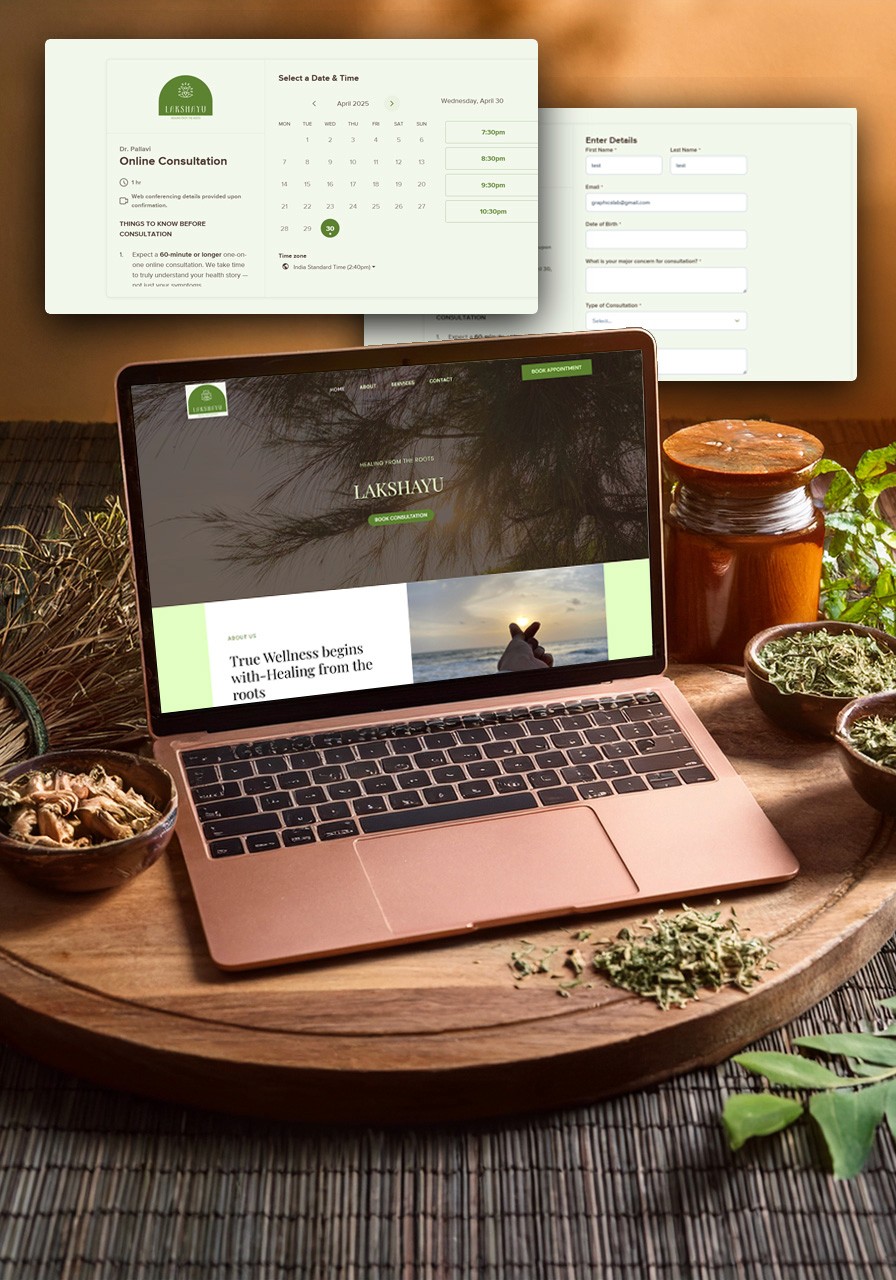
Users can now move from the landing page to a completed consultation request in under one minute.
Discover: High-level service overview.
Plan: Interactive booking that prioritizes user comfort.
Connect: A human-centric confirmation flow that bridges the gap between the website and the practitioner.
Impact
The redesign transformed the platform from a passive monitoring tool into an active decision-making environment.
Streamlined Experience: Users can now initiate a consultation request in under 60 seconds.
Personal Connection: 100% of successful bookings now result in a direct personal connection via WhatsApp, meeting the client’s goal for high-touch service.
Brand Cohesion: The earthy, minimalistic design successfully repositioned Lakshayu as a modern, approachable wellness partner.
More Works

From Data to Connection
Designing a Human-Centric Booking Flow and streamlining the Lakshayu Web Experience
Healthcare
UX UI
Lakshayu is an Ayurvedic consultation platform dedicated to guiding individuals through personalized wellness plans that promote both preventive care and therapeutic healing. This project involved designing a digital gateway that translates the complex, holistic nature of Ayurveda into a clean, modern, and accessible web experience.
Problem
The primary challenge was a disconnect between the brand's identity and its digital presence. Ayurveda is often perceived as traditional or "old-school," which can sometimes feel intimidating or clinical to modern users.
The User Barrier
Potential clients were hesitant to book sessions due to overwhelming forms and a lack of clarity on how an ancient practice fits into a fast-paced modern lifestyle.
The Transaction Friction
The client preferred a manual, personal transaction process via WhatsApp over a standard automated payment gateway, necessitating a non-traditional "human-in-the-loop" conversion flow.
Research
To bridge the gap between tradition and technology, I conducted research into the "Wellness Seeker" demographic
Competitive Analysis: Evaluated modern health-tech platforms versus traditional local clinics. Most local clinics lacked digital booking, while global health apps felt too "cold" and clinical.
Stakeholder Interviews: Identified that the brand's core value was "human connection." The digital tool needed to facilitate, not replace, the personal relationship between the practitioner and the patient.
Contextual Inquiry: Looked into how users prefer to pay for high-trust services like medical consultations; many preferred direct communication before committing financially.
Insights
Calmness as a Feature
In a stressful healthcare market, a "calm" UI acts as the first step of the therapy itself.
Trust over Automation
For Ayurvedic consultations, users value a personal check-in. The WhatsApp integration wasn't just a technical choice; it was a trust-building feature.
Hierarchy of Wellness
Users need to understand the "Preventive" vs. "Therapeutic" split immediately to self-identify their needs.
Prototype
Interactive prototypes were developed in Figma to test responsive behaviors, complex state changes, and high-density layouts across devices.
Low-fidelity sketches focused on maximizing "breathability" (whitespace):
The Hero Section: Focused on imagery of nature and balance rather than medical equipment.
The Booking Grid: Designed as a step-by-step progress bar to prevent form fatigue.
Mobile-First approach: Ensuring the WhatsApp handoff felt native to mobile users who already use the app for daily communication.
The visual language was built around "Healing from the Roots"
Color Palette: An earthy, organic palette featuring soft greens and warm neutrals to align with the brand’s wellness ethos.
Typography: A mix of a sophisticated serif for headers (heritage) and a clean sans-serif for body text (modernity).
Imagery: Utilizing soft-focus photography of botanicals and peaceful human interactions to create a welcoming atmosphere.
Prototype
Testing
Conducted moderated usability testing with five participants
Feedback: Users initially found the lack of a payment gateway confusing.
Iteration: I added microcopy on the confirmation page explaining why they were being redirected ("To ensure your plan is fully personalized, our lead consultant will finalize details with you on WhatsApp"). This turned a potential friction point into a premium service highlight.
Solution
The final website is a streamlined, three-tiered experience
0 seconds
0 seconds
Consultation Initiation
Users can now move from the landing page to a completed consultation request in under one minute.
Discover: High-level service overview.
Plan: Interactive booking that prioritizes user comfort.
Connect: A human-centric confirmation flow that bridges the gap between the website and the practitioner.
Impact
The redesign transformed the platform from a passive monitoring tool into an active decision-making environment.
Streamlined Experience: Users can now initiate a consultation request in under 60 seconds.
Personal Connection: 100% of successful bookings now result in a direct personal connection via WhatsApp, meeting the client’s goal for high-touch service.
Brand Cohesion: The earthy, minimalistic design successfully repositioned Lakshayu as a modern, approachable wellness partner.
More Works
From Data to Connection
Designing a Human-Centric Booking Flow and streamlining the Lakshayu Web Experience
Healthcare
UX UI
Lakshayu is an Ayurvedic consultation platform dedicated to guiding individuals through personalized wellness plans that promote both preventive care and therapeutic healing. This project involved designing a digital gateway that translates the complex, holistic nature of Ayurveda into a clean, modern, and accessible web experience.
Problem
The primary challenge was a disconnect between the brand's identity and its digital presence. Ayurveda is often perceived as traditional or "old-school," which can sometimes feel intimidating or clinical to modern users.
The User Barrier
Potential clients were hesitant to book sessions due to overwhelming forms and a lack of clarity on how an ancient practice fits into a fast-paced modern lifestyle.
The Transaction Friction
The client preferred a manual, personal transaction process via WhatsApp over a standard automated payment gateway, necessitating a non-traditional "human-in-the-loop" conversion flow.
Research
To bridge the gap between tradition and technology, I conducted research into the "Wellness Seeker" demographic
Competitive Analysis: Evaluated modern health-tech platforms versus traditional local clinics. Most local clinics lacked digital booking, while global health apps felt too "cold" and clinical.
Stakeholder Interviews: Identified that the brand's core value was "human connection." The digital tool needed to facilitate, not replace, the personal relationship between the practitioner and the patient.
Contextual Inquiry: Looked into how users prefer to pay for high-trust services like medical consultations; many preferred direct communication before committing financially.
Insights
Calmness as a Feature
In a stressful healthcare market, a "calm" UI acts as the first step of the therapy itself.
Trust over Automation
For Ayurvedic consultations, users value a personal check-in. The WhatsApp integration wasn't just a technical choice; it was a trust-building feature.
Hierarchy of Wellness
Users need to understand the "Preventive" vs. "Therapeutic" split immediately to self-identify their needs.
Prototype
Interactive prototypes were developed in Figma to test responsive behaviors, complex state changes, and high-density layouts across devices.
Low-fidelity sketches focused on maximizing "breathability" (whitespace):
The Hero Section: Focused on imagery of nature and balance rather than medical equipment.
The Booking Grid: Designed as a step-by-step progress bar to prevent form fatigue.
Mobile-First approach: Ensuring the WhatsApp handoff felt native to mobile users who already use the app for daily communication.
The visual language was built around "Healing from the Roots"
Color Palette: An earthy, organic palette featuring soft greens and warm neutrals to align with the brand’s wellness ethos.
Typography: A mix of a sophisticated serif for headers (heritage) and a clean sans-serif for body text (modernity).
Imagery: Utilizing soft-focus photography of botanicals and peaceful human interactions to create a welcoming atmosphere.
Prototype
Testing
Conducted moderated usability testing with five participants
Feedback: Users initially found the lack of a payment gateway confusing.
Iteration: I added microcopy on the confirmation page explaining why they were being redirected ("To ensure your plan is fully personalized, our lead consultant will finalize details with you on WhatsApp"). This turned a potential friction point into a premium service highlight.
Solution
The final website is a streamlined, three-tiered experience
0 seconds
0 seconds
Consultation Initiation
Users can now move from the landing page to a completed consultation request in under one minute.
Discover: High-level service overview.
Plan: Interactive booking that prioritizes user comfort.
Connect: A human-centric confirmation flow that bridges the gap between the website and the practitioner.
Impact
The redesign transformed the platform from a passive monitoring tool into an active decision-making environment.
Streamlined Experience: Users can now initiate a consultation request in under 60 seconds.
Personal Connection: 100% of successful bookings now result in a direct personal connection via WhatsApp, meeting the client’s goal for high-touch service.
Brand Cohesion: The earthy, minimalistic design successfully repositioned Lakshayu as a modern, approachable wellness partner.
More Works