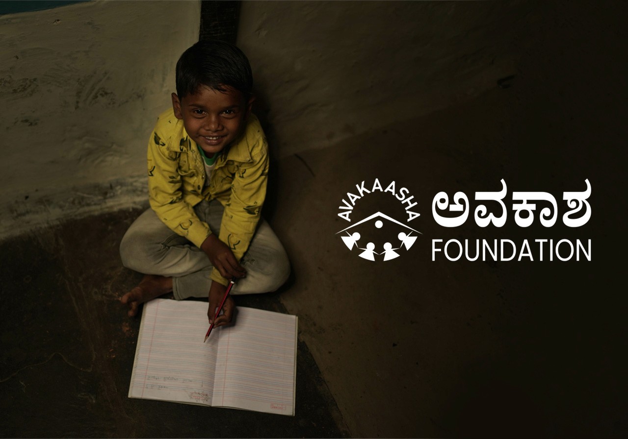
Avakaasha Foundation
Nurturing Lives Through Impactful Design
Branding
UX UI
Avakaasha Foundation is a non-governmental organization (NGO) dedicated to social welfare and community growth. This project focused on a comprehensive digital transformation to better represent the Foundation’s mission of nurturing lives with clarity and strength.
Problem
The Foundation struggled with an outdated digital presence that failed to communicate its mission effectively.
Ineffective Communication
The existing website didn't clearly highlight achievements or ongoing initiatives.
Engagement Barriers
A lack of modern design and user-friendly features made it difficult for the audience to connect or support the cause.
Visual Disconnect
The absence of high-quality, authentic visuals made their work feel disconnected from the real-world impact they were creating.
Research
The transformation began with understanding the NGO landscape and the psychology of altruism
Stakeholder Workshops: Collaborated with Foundation leads to define core values: Compassion, Growth, and Clarity.
Audience Personas: Identified key user groups, including potential donors, volunteers, and corporate partners. Research showed that donors prioritize transparency and emotional storytelling.
Competitive Audit: Noted that successful social welfare sites use high-quality, authentic photography to build immediate trust.
Insights
Earthy Connection
For an NGO grounded in social welfare, a "muted maroon and earthy green" palette better reflects the organic nature of community growth than sterile corporate colors.
Storytelling > Statistics
While data is important, donors are moved by individual success stories. The UI needed to serve as a narrative platform.
Authenticity is Currency
Stock photos can't represent real social change; professional, on-the-ground photography is essential for credibility.
Prototype
Interactive prototypes were developed in Figma to test responsive behaviors, complex state changes, and high-density layouts across devices.
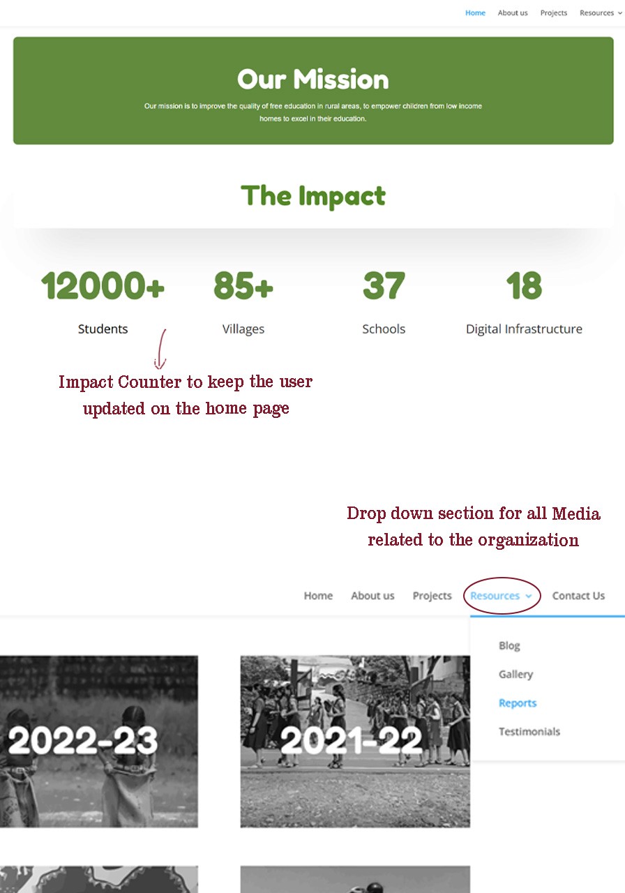
Low-fidelity prototypes focused on "Information Architecture for Impact"
Clean Narrative Blocks: Structuring the mission, goals, and projects into easily digestible sections.
Priority Placement: Placing "Get Involved" CTAs in persistent but non-intrusive locations.
Responsive Layout: Ensuring the emotional storytelling translated perfectly from desktop to mobile devices.
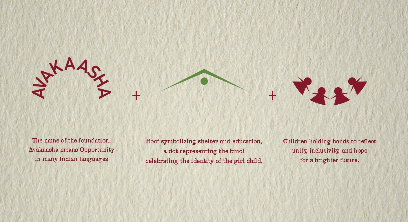
The visual identity centered on a "warm, inclusive vibe"
Palette: A sophisticated blend of muted maroon (compassion) and earthy green (growth).
Typography: Clear and accessible typefaces that convey strength and clarity.
Visual Content: High-quality graphics and on-site photography that vividly showcase community activities and projects.
Prototype
Testing
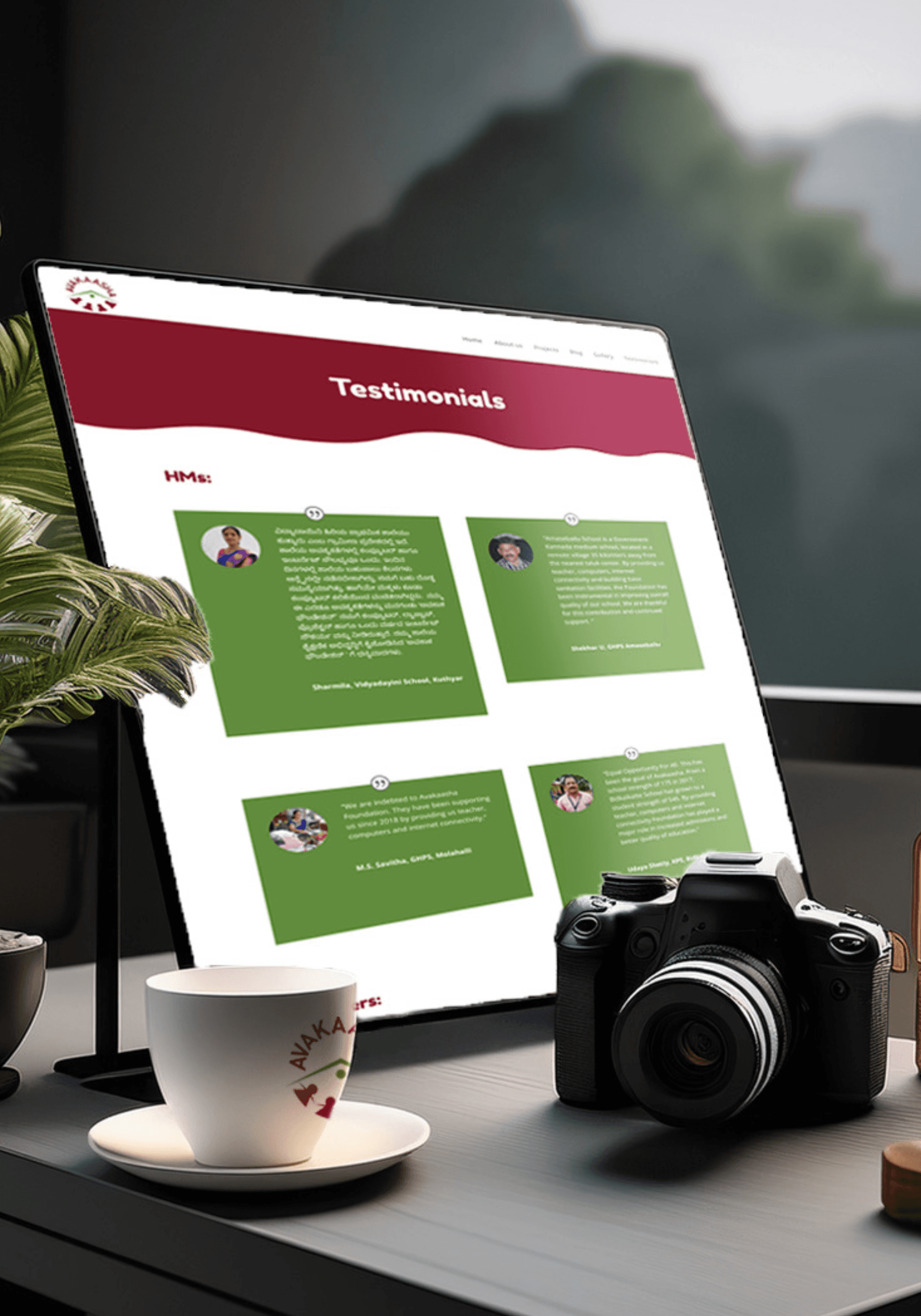
Testing involved gathering feedback from existing volunteers and potential donors
Initial Feedback: Users felt the site was much more "human" and trustworthy.
Adjustment: Refined the "Get Involved" flow to be even more direct, ensuring that the path from inspiration to action is as short as possible.
Solution
The final outcome was a multi-dimensional brand overhaul
Website Overhaul: A responsive, modern interface with clear information architecture.
Photography Integration: Custom photoshoots documenting ongoing projects for vivid storytelling.
Social Strategy: Branded graphics and posters for all platforms to increase cohesive reach.
Content Strategy: Compelling blog posts and success stories designed to encourage involvement.
Impact
The redesign transformed the platform from a passive monitoring tool into an active decision-making environment.
Enhanced Engagement: The cohesive rebranding and consistent visuals amplified the Foundation's reach and impact across digital platforms.
Improved Transparency: Clearer documentation of initiatives fostered a stronger connection with supporters.
Storytelling Success: High-quality photography and compelling content increased the emotional resonance of the Foundation's message.
More Works

Avakaasha Foundation
Nurturing Lives Through Impactful Design
Branding
UX UI
Avakaasha Foundation is a non-governmental organization (NGO) dedicated to social welfare and community growth. This project focused on a comprehensive digital transformation to better represent the Foundation’s mission of nurturing lives with clarity and strength.
Problem
The Foundation struggled with an outdated digital presence that failed to communicate its mission effectively.
Ineffective Communication
The existing website didn't clearly highlight achievements or ongoing initiatives.
Engagement Barriers
A lack of modern design and user-friendly features made it difficult for the audience to connect or support the cause.
Visual Disconnect
The absence of high-quality, authentic visuals made their work feel disconnected from the real-world impact they were creating.
Research
The transformation began with understanding the NGO landscape and the psychology of altruism
Stakeholder Workshops: Collaborated with Foundation leads to define core values: Compassion, Growth, and Clarity.
Audience Personas: Identified key user groups, including potential donors, volunteers, and corporate partners. Research showed that donors prioritize transparency and emotional storytelling.
Competitive Audit: Noted that successful social welfare sites use high-quality, authentic photography to build immediate trust.
Insights
Earthy Connection
For an NGO grounded in social welfare, a "muted maroon and earthy green" palette better reflects the organic nature of community growth than sterile corporate colors.
Storytelling > Statistics
While data is important, donors are moved by individual success stories. The UI needed to serve as a narrative platform.
Authenticity is Currency
Stock photos can't represent real social change; professional, on-the-ground photography is essential for credibility.
Prototype
Interactive prototypes were developed in Figma to test responsive behaviors, complex state changes, and high-density layouts across devices.
Low-fidelity prototypes focused on "Information Architecture for Impact"
Clean Narrative Blocks: Structuring the mission, goals, and projects into easily digestible sections.
Priority Placement: Placing "Get Involved" CTAs in persistent but non-intrusive locations.
Responsive Layout: Ensuring the emotional storytelling translated perfectly from desktop to mobile devices.
The visual identity centered on a "warm, inclusive vibe"
Palette: A sophisticated blend of muted maroon (compassion) and earthy green (growth).
Typography: Clear and accessible typefaces that convey strength and clarity.
Visual Content: High-quality graphics and on-site photography that vividly showcase community activities and projects.
Prototype
Testing
Testing involved gathering feedback from existing volunteers and potential donors
Initial Feedback: Users felt the site was much more "human" and trustworthy.
Adjustment: Refined the "Get Involved" flow to be even more direct, ensuring that the path from inspiration to action is as short as possible.
Solution
The final outcome was a multi-dimensional brand overhaul
Website Overhaul: A responsive, modern interface with clear information architecture.
Photography Integration: Custom photoshoots documenting ongoing projects for vivid storytelling.
Social Strategy: Branded graphics and posters for all platforms to increase cohesive reach.
Content Strategy: Compelling blog posts and success stories designed to encourage involvement.
Impact
The redesign transformed the platform from a passive monitoring tool into an active decision-making environment.
Enhanced Engagement: The cohesive rebranding and consistent visuals amplified the Foundation's reach and impact across digital platforms.
Improved Transparency: Clearer documentation of initiatives fostered a stronger connection with supporters.
Storytelling Success: High-quality photography and compelling content increased the emotional resonance of the Foundation's message.
More Works
Avakaasha Foundation
Nurturing Lives Through Impactful Design
Branding
UX UI
Avakaasha Foundation is a non-governmental organization (NGO) dedicated to social welfare and community growth. This project focused on a comprehensive digital transformation to better represent the Foundation’s mission of nurturing lives with clarity and strength.
Problem
The Foundation struggled with an outdated digital presence that failed to communicate its mission effectively.
Ineffective Communication
The existing website didn't clearly highlight achievements or ongoing initiatives.
Engagement Barriers
A lack of modern design and user-friendly features made it difficult for the audience to connect or support the cause.
Visual Disconnect
The absence of high-quality, authentic visuals made their work feel disconnected from the real-world impact they were creating.
Research
The transformation began with understanding the NGO landscape and the psychology of altruism
Stakeholder Workshops: Collaborated with Foundation leads to define core values: Compassion, Growth, and Clarity.
Audience Personas: Identified key user groups, including potential donors, volunteers, and corporate partners. Research showed that donors prioritize transparency and emotional storytelling.
Competitive Audit: Noted that successful social welfare sites use high-quality, authentic photography to build immediate trust.
Insights
Earthy Connection
For an NGO grounded in social welfare, a "muted maroon and earthy green" palette better reflects the organic nature of community growth than sterile corporate colors.
Storytelling > Statistics
While data is important, donors are moved by individual success stories. The UI needed to serve as a narrative platform.
Authenticity is Currency
Stock photos can't represent real social change; professional, on-the-ground photography is essential for credibility.
Prototype
Interactive prototypes were developed in Figma to test responsive behaviors, complex state changes, and high-density layouts across devices.
Low-fidelity prototypes focused on "Information Architecture for Impact"
Clean Narrative Blocks: Structuring the mission, goals, and projects into easily digestible sections.
Priority Placement: Placing "Get Involved" CTAs in persistent but non-intrusive locations.
Responsive Layout: Ensuring the emotional storytelling translated perfectly from desktop to mobile devices.
The visual identity centered on a "warm, inclusive vibe"
Palette: A sophisticated blend of muted maroon (compassion) and earthy green (growth).
Typography: Clear and accessible typefaces that convey strength and clarity.
Visual Content: High-quality graphics and on-site photography that vividly showcase community activities and projects.
Prototype
Testing
Testing involved gathering feedback from existing volunteers and potential donors
Initial Feedback: Users felt the site was much more "human" and trustworthy.
Adjustment: Refined the "Get Involved" flow to be even more direct, ensuring that the path from inspiration to action is as short as possible.
Solution
The final outcome was a multi-dimensional brand overhaul
Website Overhaul: A responsive, modern interface with clear information architecture.
Photography Integration: Custom photoshoots documenting ongoing projects for vivid storytelling.
Social Strategy: Branded graphics and posters for all platforms to increase cohesive reach.
Content Strategy: Compelling blog posts and success stories designed to encourage involvement.
Impact
The redesign transformed the platform from a passive monitoring tool into an active decision-making environment.
Enhanced Engagement: The cohesive rebranding and consistent visuals amplified the Foundation's reach and impact across digital platforms.
Improved Transparency: Clearer documentation of initiatives fostered a stronger connection with supporters.
Storytelling Success: High-quality photography and compelling content increased the emotional resonance of the Foundation's message.
More Works