
AI-Powered Asset Management
Transforming Asset Management Passive Dashboard to a Decision-Driven Ecosystem
Enterprise SaaS
UX UI
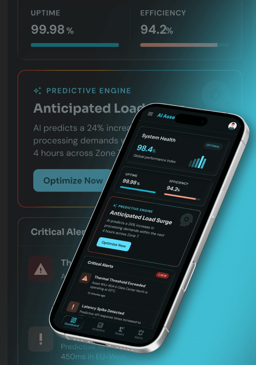
The objective was to transition an outdated, text-heavy monitoring system into an intelligent, multi-device decision system. By leveraging responsive density modes, explainable AI, and deeply contextual workflows, the redesign enables global infrastructure teams to move seamlessly from raw data to critical action.
Problem
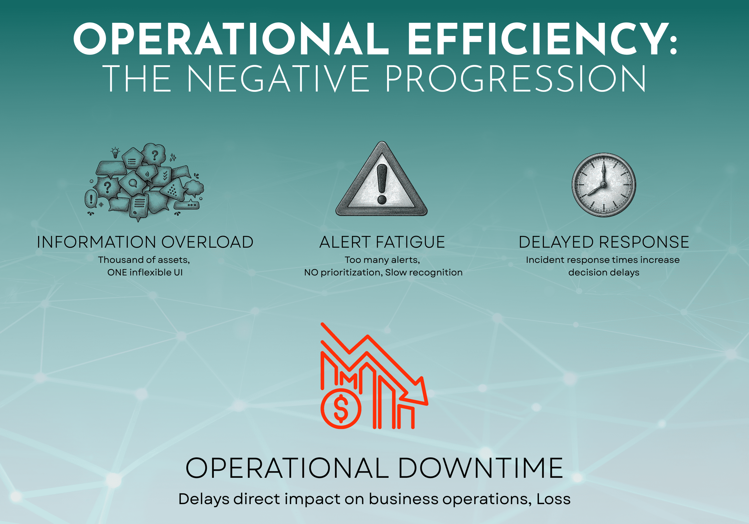
The original platform treated a highly fragmented user base as a single audience behind one inflexible UI, resulting in operational bottlenecks.
The User Split
Field Techs (Mobile): One-handed, high-stress, outdoor use with poor signal.
Office Admins (Desktop): Managing complex hierarchies, compliance, and large orders simultaneously.
Core Pain Points
Alert Fatigue: Massive signal volume without clear prioritization.
Data Fragmentation: Isolated systems preventing a unified operational view.
Slow Response: Critical failures delayed by fragmented data and slow identification.
AI Trust Gap: Predictions ignored due to a lack of transparency and reasoning.
Key Constraints
High Density: Thousands of assets generating constant real-time data.
Time-Critical: Operational delays result in direct financial penalties.
Expertise Gap: One UI must serve both frontline operators and data analysts.
Research
Traditional UX methodologies rely on direct observation and behavioral telemetry. Because neither was available for this project, the research strategy was reconstructed around remote proxies to uncover environmental and operational contexts.
The Obstacles
Zero Location Access: The target user base operated across the globe. In-person field studies, contextual inquiries, and shoulder-surfing sessions were impossible.
Zero Telemetry Data: The legacy software lacked modern product analytics. There was no tracking for page views, click maps, or drop-off rates.
Proxy Research Methodologies
The "Three-Photos" Task: Remote users submitted three photos: their physical workspace, their device screen mid-task, and their biggest operational bottleneck. This revealed environmental constraints like screen glare and gloved usage.
Targeted Diary Studies: Handpicked users logged their frustrations, workarounds, and device switches in real-time over a two-week period.
Cross-Functional Data Harvesting: Conducted interviews and analyzed logs from Customer Success teams, support tickets, and sales calls to identify recurring usability complaints.
Direct User Surveys: Focused surveys quantified feature frequency, mapping out exactly which tools were vital versus which were bloatware.
Insights
The proxy research challenged previous assumptions and revealed three foundational insights that shaped the product architecture.
Insight 1: The Hidden "Third Persona"
Beyond the obvious desktop admin and mobile technician split, research surfaced Admins on Mobile. These users do not use mobile to view dashboards; instead, they use micro-moments—waiting for coffee or walking between meetings—to unblock workflows by approving work orders, signing off on parts, and triaging escalations.
Insight 2: Frontline "Scanning over Reading"
For field technicians, typing or reading dense text while wearing gloves in the field is a major failure point. Their primary physical action is scanning physical asset tags. If the scan action isn’t instant, the app isn't viable.
Insight 3: Power Users Require Data Control
Office admins do not need simplified, clean whitespace. They need information density, structural control, and high-powered keyboard utility to process hundreds of data rows efficiently.
Prototype
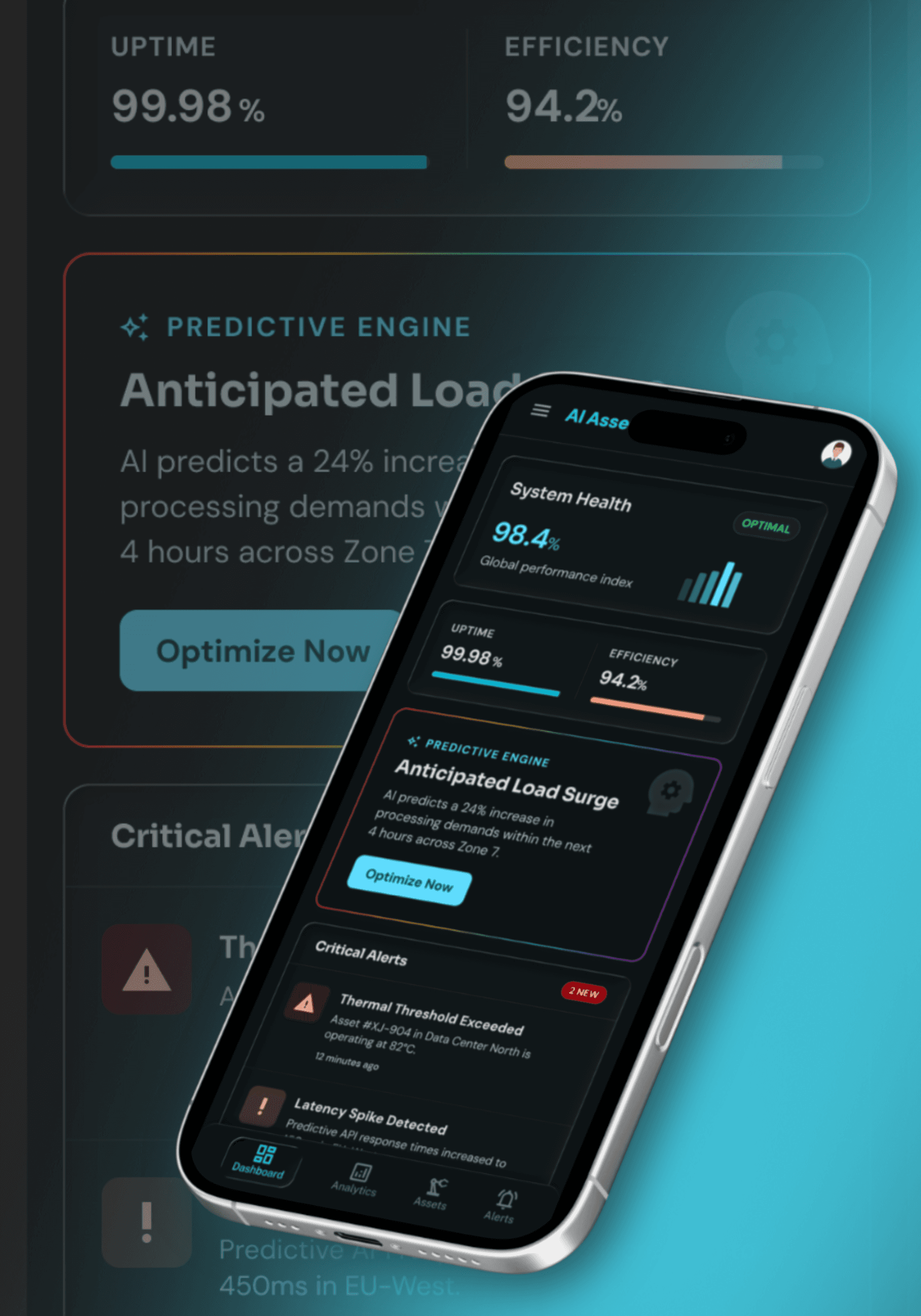
Interactive prototypes were developed in Figma to test responsive behaviors, complex state changes, and high-density layouts across devices.
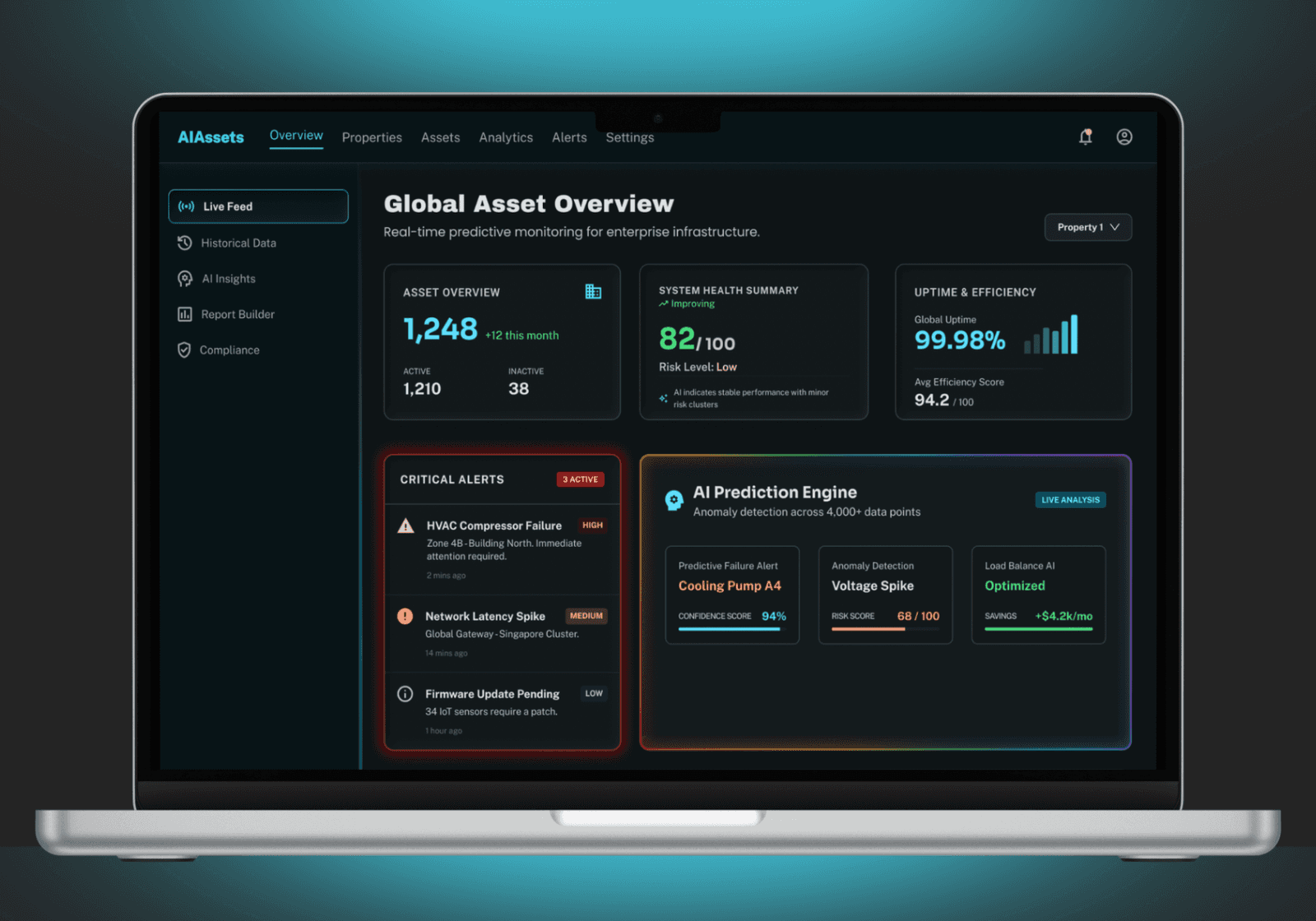
Desktop Prototypes: Focused on keyboard navigation, rapid data filtering, and layout performance when opening massive detail side-panels.
Mobile Prototypes: Modeled single-handed interactions, touch-target responsiveness, swipe gestures, and transitions within the action inbox.
Prototype
Testing
The high-fidelity prototypes underwent rigorous remote usability testing to evaluate performance under simulated real-world conditions.
Methodology
Participants: 6 Field Technicians and 5 Office Administrators.
Environmental Simulations: Technicians tested the mobile prototype outdoors on personal devices to evaluate text legibility under direct sunlight. Admins performed timed multitasking exercises on desktop monitors.
Direct Feedback & Iterations
The "Two-Tap" Guardrail: Early swiping in the mobile inbox led to accidental approvals while walking. The UI was adjusted to require a secondary tap confirmation for high-stakes financial operations.
Visual Status Contrast: Testing under outdoor glare revealed that red status badges required explicit text labels alongside color fills to remain clearly legible.
Solution
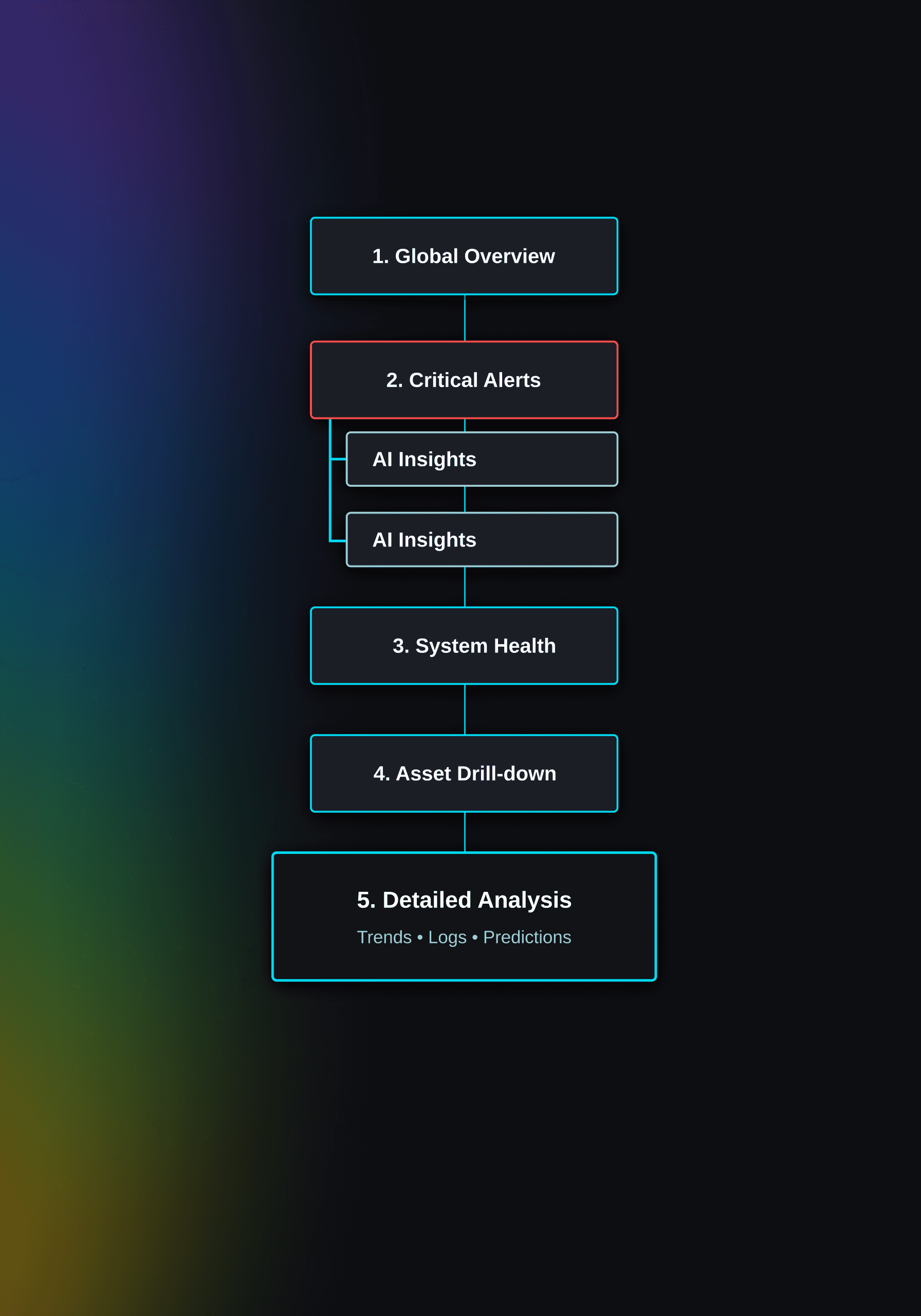
The finalized system is anchored by a four-part dashboard architecture engineered to systematically eliminate cognitive load.
0%
0%
Decrease in Alert Fatigue
AI-driven categorization and prioritization filter out noise, ensuring users only attend to high-impact signals.
Critical Alerts: Placed at the absolute top of the visual hierarchy utilizing a high-contrast red indicator. Alerts are sorted dynamically by severity for instant identification.
AI Prediction Engine: Converts raw sensor data into clear predictions, accompanied by a dedicated explanation panel displaying confidence percentages and underlying data points to bridge the AI trust gap.
System Health Overview: A clean, high-level structural visualization showing the status of the entire asset network, providing rapid situational awareness without forcing sub-menu digging.
Recommended Actions Panel: Binds every predictive insight directly to an executable task or operational next step, completely eliminating decision paralysis.
Impact
The redesign transformed the platform from a passive monitoring tool into an active decision-making environment.
Streamlined Mobile Workflows: Technicians can complete inspections using only their thumb, bypassing buried menus entirely.
Enhanced Admin Performance: Desktop users gained complete control over large datasets through advanced filtering, virtualization, and keyboard utility.
Improved Mobile Efficiency: Mobile admins can triage backlogs in short windows throughout the day using gesture-driven interactions.
More Works

AI-Powered Asset Management
Transforming Asset Management Passive Dashboard to a Decision-Driven Ecosystem
Enterprise SaaS
UX UI
The objective was to transition an outdated, text-heavy monitoring system into an intelligent, multi-device decision system. By leveraging responsive density modes, explainable AI, and deeply contextual workflows, the redesign enables global infrastructure teams to move seamlessly from raw data to critical action.
Problem
The original platform treated a highly fragmented user base as a single audience behind one inflexible UI, resulting in operational bottlenecks.
The User Split
Field Techs (Mobile): One-handed, high-stress, outdoor use with poor signal.
Office Admins (Desktop): Managing complex hierarchies, compliance, and large orders simultaneously.
Core Pain Points
Alert Fatigue: Massive signal volume without clear prioritization.
Data Fragmentation: Isolated systems preventing a unified operational view.
Slow Response: Critical failures delayed by fragmented data and slow identification.
AI Trust Gap: Predictions ignored due to a lack of transparency and reasoning.
Key Constraints
High Density: Thousands of assets generating constant real-time data.
Time-Critical: Operational delays result in direct financial penalties.
Expertise Gap: One UI must serve both frontline operators and data analysts.
Research
Traditional UX methodologies rely on direct observation and behavioral telemetry. Because neither was available for this project, the research strategy was reconstructed around remote proxies to uncover environmental and operational contexts.
The Obstacles
Zero Location Access: The target user base operated across the globe. In-person field studies, contextual inquiries, and shoulder-surfing sessions were impossible.
Zero Telemetry Data: The legacy software lacked modern product analytics. There was no tracking for page views, click maps, or drop-off rates.
Proxy Research Methodologies
The "Three-Photos" Task: Remote users submitted three photos: their physical workspace, their device screen mid-task, and their biggest operational bottleneck. This revealed environmental constraints like screen glare and gloved usage.
Targeted Diary Studies: Handpicked users logged their frustrations, workarounds, and device switches in real-time over a two-week period.
Cross-Functional Data Harvesting: Conducted interviews and analyzed logs from Customer Success teams, support tickets, and sales calls to identify recurring usability complaints.
Direct User Surveys: Focused surveys quantified feature frequency, mapping out exactly which tools were vital versus which were bloatware.
Insights
The proxy research challenged previous assumptions and revealed three foundational insights that shaped the product architecture.
Insight 1: The Hidden "Third Persona"
Beyond the obvious desktop admin and mobile technician split, research surfaced Admins on Mobile. These users do not use mobile to view dashboards; instead, they use micro-moments—waiting for coffee or walking between meetings—to unblock workflows by approving work orders, signing off on parts, and triaging escalations.
Insight 2: Frontline "Scanning over Reading"
For field technicians, typing or reading dense text while wearing gloves in the field is a major failure point. Their primary physical action is scanning physical asset tags. If the scan action isn’t instant, the app isn't viable.
Insight 3: Power Users Require Data Control
Office admins do not need simplified, clean whitespace. They need information density, structural control, and high-powered keyboard utility to process hundreds of data rows efficiently.
Prototype
Interactive prototypes were developed in Figma to test responsive behaviors, complex state changes, and high-density layouts across devices.
Desktop Prototypes: Focused on keyboard navigation, rapid data filtering, and layout performance when opening massive detail side-panels.
Mobile Prototypes: Modeled single-handed interactions, touch-target responsiveness, swipe gestures, and transitions within the action inbox.
Prototype
Testing
The high-fidelity prototypes underwent rigorous remote usability testing to evaluate performance under simulated real-world conditions.
Methodology
Participants: 6 Field Technicians and 5 Office Administrators.
Environmental Simulations: Technicians tested the mobile prototype outdoors on personal devices to evaluate text legibility under direct sunlight. Admins performed timed multitasking exercises on desktop monitors.
Direct Feedback & Iterations
The "Two-Tap" Guardrail: Early swiping in the mobile inbox led to accidental approvals while walking. The UI was adjusted to require a secondary tap confirmation for high-stakes financial operations.
Visual Status Contrast: Testing under outdoor glare revealed that red status badges required explicit text labels alongside color fills to remain clearly legible.
Solution
The finalized system is anchored by a four-part dashboard architecture engineered to systematically eliminate cognitive load.
0%
0%
Decrease in Alert Fatigue
AI-driven categorization and prioritization filter out noise, ensuring users only attend to high-impact signals.
Critical Alerts: Placed at the absolute top of the visual hierarchy utilizing a high-contrast red indicator. Alerts are sorted dynamically by severity for instant identification.
AI Prediction Engine: Converts raw sensor data into clear predictions, accompanied by a dedicated explanation panel displaying confidence percentages and underlying data points to bridge the AI trust gap.
System Health Overview: A clean, high-level structural visualization showing the status of the entire asset network, providing rapid situational awareness without forcing sub-menu digging.
Recommended Actions Panel: Binds every predictive insight directly to an executable task or operational next step, completely eliminating decision paralysis.
Impact
The redesign transformed the platform from a passive monitoring tool into an active decision-making environment.
Streamlined Mobile Workflows: Technicians can complete inspections using only their thumb, bypassing buried menus entirely.
Enhanced Admin Performance: Desktop users gained complete control over large datasets through advanced filtering, virtualization, and keyboard utility.
Improved Mobile Efficiency: Mobile admins can triage backlogs in short windows throughout the day using gesture-driven interactions.
More Works
AI-Powered Asset Management
Transforming Asset Management Passive Dashboard to a Decision-Driven Ecosystem
Enterprise SaaS
UX UI
The objective was to transition an outdated, text-heavy monitoring system into an intelligent, multi-device decision system. By leveraging responsive density modes, explainable AI, and deeply contextual workflows, the redesign enables global infrastructure teams to move seamlessly from raw data to critical action.
Problem
The original platform treated a highly fragmented user base as a single audience behind one inflexible UI, resulting in operational bottlenecks.
The User Split
Field Techs (Mobile): One-handed, high-stress, outdoor use with poor signal.
Office Admins (Desktop): Managing complex hierarchies, compliance, and large orders simultaneously.
Core Pain Points
Alert Fatigue: Massive signal volume without clear prioritization.
Data Fragmentation: Isolated systems preventing a unified operational view.
Slow Response: Critical failures delayed by fragmented data and slow identification.
AI Trust Gap: Predictions ignored due to a lack of transparency and reasoning.
Key Constraints
High Density: Thousands of assets generating constant real-time data.
Time-Critical: Operational delays result in direct financial penalties.
Expertise Gap: One UI must serve both frontline operators and data analysts.
Research
Traditional UX methodologies rely on direct observation and behavioral telemetry. Because neither was available for this project, the research strategy was reconstructed around remote proxies to uncover environmental and operational contexts.
The Obstacles
Zero Location Access: The target user base operated across the globe. In-person field studies, contextual inquiries, and shoulder-surfing sessions were impossible.
Zero Telemetry Data: The legacy software lacked modern product analytics. There was no tracking for page views, click maps, or drop-off rates.
Proxy Research Methodologies
The "Three-Photos" Task: Remote users submitted three photos: their physical workspace, their device screen mid-task, and their biggest operational bottleneck. This revealed environmental constraints like screen glare and gloved usage.
Targeted Diary Studies: Handpicked users logged their frustrations, workarounds, and device switches in real-time over a two-week period.
Cross-Functional Data Harvesting: Conducted interviews and analyzed logs from Customer Success teams, support tickets, and sales calls to identify recurring usability complaints.
Direct User Surveys: Focused surveys quantified feature frequency, mapping out exactly which tools were vital versus which were bloatware.
Insights
The proxy research challenged previous assumptions and revealed three foundational insights that shaped the product architecture.
Insight 1: The Hidden "Third Persona"
Beyond the obvious desktop admin and mobile technician split, research surfaced Admins on Mobile. These users do not use mobile to view dashboards; instead, they use micro-moments—waiting for coffee or walking between meetings—to unblock workflows by approving work orders, signing off on parts, and triaging escalations.
Insight 2: Frontline "Scanning over Reading"
For field technicians, typing or reading dense text while wearing gloves in the field is a major failure point. Their primary physical action is scanning physical asset tags. If the scan action isn’t instant, the app isn't viable.
Insight 3: Power Users Require Data Control
Office admins do not need simplified, clean whitespace. They need information density, structural control, and high-powered keyboard utility to process hundreds of data rows efficiently.
Prototype
Interactive prototypes were developed in Figma to test responsive behaviors, complex state changes, and high-density layouts across devices.
Desktop Prototypes: Focused on keyboard navigation, rapid data filtering, and layout performance when opening massive detail side-panels.
Mobile Prototypes: Modeled single-handed interactions, touch-target responsiveness, swipe gestures, and transitions within the action inbox.
Prototype
Testing
The high-fidelity prototypes underwent rigorous remote usability testing to evaluate performance under simulated real-world conditions.
Methodology
Participants: 6 Field Technicians and 5 Office Administrators.
Environmental Simulations: Technicians tested the mobile prototype outdoors on personal devices to evaluate text legibility under direct sunlight. Admins performed timed multitasking exercises on desktop monitors.
Direct Feedback & Iterations
The "Two-Tap" Guardrail: Early swiping in the mobile inbox led to accidental approvals while walking. The UI was adjusted to require a secondary tap confirmation for high-stakes financial operations.
Visual Status Contrast: Testing under outdoor glare revealed that red status badges required explicit text labels alongside color fills to remain clearly legible.
Solution
The finalized system is anchored by a four-part dashboard architecture engineered to systematically eliminate cognitive load.
0%
0%
Decrease in Alert Fatigue
AI-driven categorization and prioritization filter out noise, ensuring users only attend to high-impact signals.
Critical Alerts: Placed at the absolute top of the visual hierarchy utilizing a high-contrast red indicator. Alerts are sorted dynamically by severity for instant identification.
AI Prediction Engine: Converts raw sensor data into clear predictions, accompanied by a dedicated explanation panel displaying confidence percentages and underlying data points to bridge the AI trust gap.
System Health Overview: A clean, high-level structural visualization showing the status of the entire asset network, providing rapid situational awareness without forcing sub-menu digging.
Recommended Actions Panel: Binds every predictive insight directly to an executable task or operational next step, completely eliminating decision paralysis.
Impact
The redesign transformed the platform from a passive monitoring tool into an active decision-making environment.
Streamlined Mobile Workflows: Technicians can complete inspections using only their thumb, bypassing buried menus entirely.
Enhanced Admin Performance: Desktop users gained complete control over large datasets through advanced filtering, virtualization, and keyboard utility.
Improved Mobile Efficiency: Mobile admins can triage backlogs in short windows throughout the day using gesture-driven interactions.
More Works